New Brunswick Business Council
Logo Design
About the Client – New Brunswick Business Council (NBBC)
New Brunswick Business Council (NBBC) is a non-partisan organization that advocates for better business in New Brunswick. It consists of some of New Brunswick’s most influential business leaders and CEOs, who meet regularly to explore how the province can meet its full potential. The Council goes beyond a ‘think’ tank, acting as a ‘do’ tank and a convener to positively transform social and economic policy.
The Challenge
After nearly a decade of use, NBBC’s old logo was beginning to show its age.
There was confusion about whether the original logo was supposed to look like a sail or represent pages in a book. The Council wanted something with greater meaning that better reflected NBBC’s desire for forward momentum.
For these reasons, NBBC chose The Ginger Agency to create its fresh new logo.
Our Work at Ginger
The Ginger Agency set out to re-design NBBC’s logo so it better reflected their organization’s brand identity.
“As soon as we began the conversation with Ginger, we knew they understood what we were wanting to accomplish” says Adrienne O’Pray, president & CEO of NBBC.
Ginger presented four dynamic, different ideas for NBBC’s review and consideration. “The options were all so creative and on the mark that it was difficult for us to make a final decision,” says O’Pray. “There was no way we could lose with any of the options!”
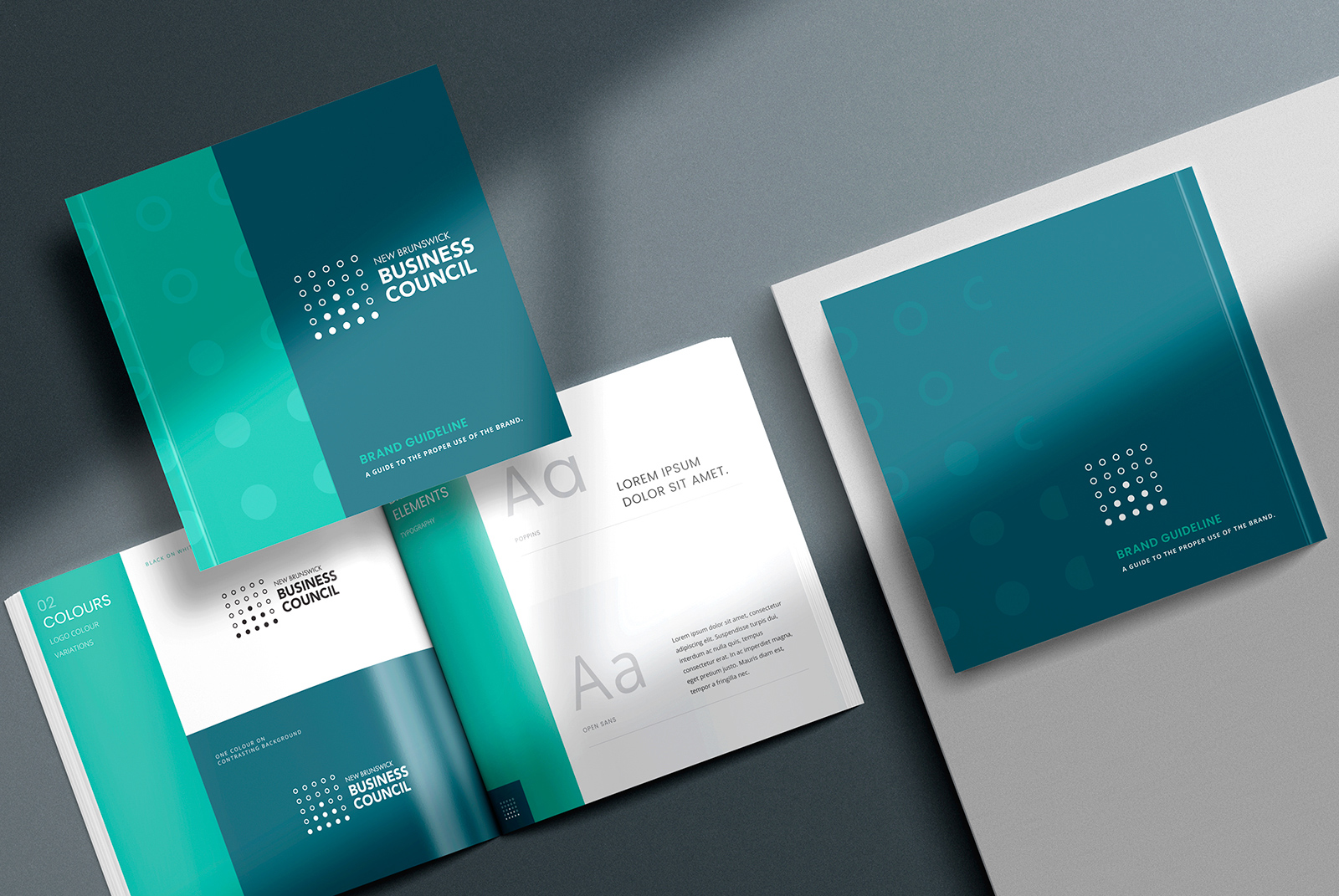
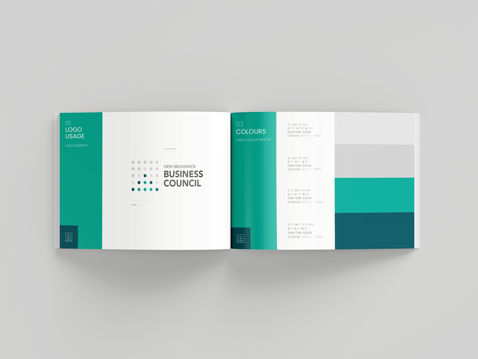
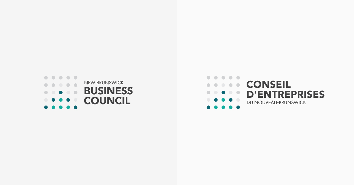
Ultimately, NBBC chose a clean logo design with dots representing each of the Council’s valued members. Ginger’s design team used colour within the dots to create an upward arrow, indicative of progress toward NBBC’s collective goals.
“The forward movement presented through the arrow represents the collectivity of our members,” says O’Pray. “It was a well-thought-out idea that encompasses the change we wanted.”
To accompany the graphical element of the brand, Ginger used Futura PT and Avenir Black, a strong sans-serif typography that’s highly readable at any size. This no-nonsense typeface is serious without being too stuffy, encouraging more engagement with the NBBC brand.
The logo remains bilingual in English and French. The words “New Brunswick” and “du Nouveau-Brunswick” were set in uppercase (at normal weight), while “BUSINESS COUNCIL” and “CONSEIL D’ENTREPRISES” were set in bold uppercase for more visual emphasis.
Since NBBC is a non-partisan organization, colour choice was also an important consideration. NBBC wanted to avoid colours with potential political associations in New Brunswick (red, blue, green, purple). So, Ginger used shades of gray and teal in its final design to maintain an expectation of third-party neutrality.
The Result
The Ginger Agency successfully designed a modernized logo that matches the ever-evolving brand of NBBC and its members. The new NBBC logo was then used as part of a larger website modernization project to revive the Council’s brand in the province.
“We love the freshness, simplicity, and balance the new brand offers to our organization,” says O’Pray.
Want to build a confident brand for your company or organization? We’d love to chat!
You can reach us at info@gingeragency.ca or at 51 York St. in Fredericton, N.B.